Making Sense of Numbers
Thursday, May 03, 2012, at 06:02PM
By Eric Richardson
Graphs of listener data powered by Cubism
After several partial-deployment tests, we launched StreamMachine at KPCC on Tuesday evening, putting online listeners in the hands of a Node.JS app that I barely figured out how to start writing back in January.
There have been a few hiccups—I don't think people with Roku boxes are very happy at the moment—but on the whole it's been a very successful launch.
While audio streaming provides a number of interesting challenges—how do you handle deployment of new app versions when your connections are of indefinite length, for instance—I'm really interested to play with ways of visualizing listener behavior and interactions.
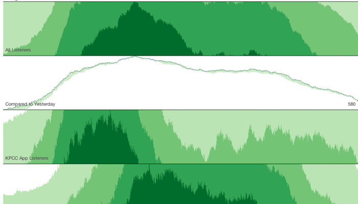
For the StreamMachine launch I'm using a pair of really interesting open source packages put out recently by Square to enable real-time analysis of listening patterns. Cube is a datastore built on top of MongoDB that's designed specifically for time-series data. Cubism is a visualization plugin using d3 that then turns that data into interesting visuals.
Traditional logging for a listening stream doesn't make for a very good event. Saying that a listener completed a 45-minute streaming session at 6:55pm is great, but that data point needs to be spread out over the whole listening period to give a true picture.
But what if instead you logged every minute listened as it was listened? You would end up with a series of events taking place at the right time in the timeline, and you could then analyze them as they're still in progress.
The screenshot above shows the results, which gives a snapshot of all listening, a comparison to yesterday's stats, and a view of KPCC app listening vs some in-browser numbers. Refining the options and presentation is a work-in-progress, but already it's a fascinating live view of what's going out of our servers.